
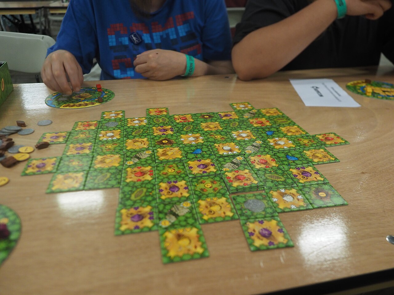
A color can carry information, but it need not carry it alone
A gaming exhibit can make a component’s purpose visible through color, shape, icon, text, position or texture. Looking for those channels helps explain how a design communicates. It also reveals when two pieces that seem distinct to one visitor might be difficult for another to distinguish. Microsoft’s Xbox Accessibility Guideline 103 discusses expressing important information through more than one sensory method and avoiding reliance on color alone. Its digital-game guidance provides a primary reference for the principle; the tabletop examples here are original illustrations. They do not certify a particular game as accessible or assume that one alternate cue resolves every person’s needs.
Ask what the color means
Begin with the game’s documented relationship between color and function. A color might identify a player, a resource, a team or a decorative theme. In a fictional game called Station Tiles, blue and orange tokens represent two different kinds of cargo. Because the distinction affects which spaces accept a token, it carries rule information. If the colors merely decorate identical tokens, the distinction has another role. At a convention table, observe the function before judging the cue. The same visual palette can be adequate for a decorative pattern yet insufficient to communicate a rule-critical difference in a particular presentation.
Add a second identity cue in an example
Suppose the blue cargo tokens also carry a circle and the orange tokens carry a triangle. Someone can then identify cargo type through either the color or the printed symbol, provided that they can perceive and interpret that symbol. The second cue communicates the same distinction, rather than introducing another rule. If circles mean one thing in one area of the board and another elsewhere, the system becomes harder to read. This example explains redundancy through a specific design relationship. The cue comparison separates information design from the different viewing conditions a demonstration can present.
Shape and size answer different questions
A piece’s outline can identify a category, while its size might indicate quantity or significance. Mixing those relationships without explanation can create ambiguity. Imagine Station Tiles using large and small circles for different cargo amounts. The circle still identifies the cargo type, while the size supplies a second dimension of information. A player must know both relationships. If the display instead uses triangles merely because they fit a storage tray, that physical shape may have no rule meaning. The distinction between intentional information and incidental construction matters when describing a component. A visible difference is not automatically a meaningful game cue.
A symbol needs an explanation somewhere
An icon can be compact without being self-explanatory. A lightning-shaped mark could represent energy, a fast action or another concept entirely. In the game, the rule reference defines the circle as parcel cargo and the triangle as fragile cargo. That makes the symbols interpretable, but players still need access to the explanation. Check whether the displayed reference uses the same symbol consistently across cards and board spaces. A label saying blue cargo in one place and a circle-only diagram in another could make the relationship less clear. The observation concerns the information system, not a verdict on the whole game based on one component.
Position can supplement identity
A designated area on a board can reinforce what belongs there. In Station Tiles, a circle-marked space might visually correspond with the circle-marked token. That spatial relationship helps connect a piece with an action location. It does not eliminate the need to distinguish tokens held away from the board. Consider the situations separately: choosing from a supply, reading another player’s area and interpreting a score display can require different cues. A component design that is easy to identify close up may communicate less clearly at the far end of a large demonstration table. Describe the viewing situation alongside the cue being examined.
Digital displays can use parallel channels
A game can pair a visible alert with a sound, a label or another supported signal. Microsoft’s accessibility guidance addresses these multiple channels in digital contexts, while its broader Xbox accessibility resources describe available customization features. The example here is a delivery-game alert that shows a parcel icon and a written cargo name alongside a color. Those elements can provide overlapping information, but their usefulness depends on how they appear and on the player’s circumstances. A short exhibit demonstration may show only one configuration. Do not infer that every alternative is present in the released game or that a menu label proves complete coverage.
Describe the cue system you can actually see
A precise note might read: cargo type is identified by color and icon, while amount is indicated by token size. That statement gives the reader a meaningful picture of the design. If an exhibit provides accessibility documentation, connect your observation with the particular feature described there. If it does not, avoid turning a personal impression into a universal claim. At a component-design exhibit, select one rule-critical distinction and identify every cue that communicates it. The resulting description can be compared with the presenter’s documentation without turning a brief personal impression into a claim about every player’s experience.
Continue exploring
Explore related events
Current facts come from the directory. Follow the exact listing for admission, venue information and the official source.
Gen Con Indy 2027 · Aug 5 – Aug 8, 2027 · scheduled · 2027 dates announced; badge-sale schedule requires current organizer confirmation
Sources and further reading
- Microsoft: Xbox Accessibility Guideline 103, additional channels for visual and audio cues ↗
- Xbox: Accessibility features ↗
Source review: 2026-10-12. Examples identified as hypothetical are original illustrations.
An independently researched feature. Worked examples are illustrative; photographs identify their archive or collection context.
Find your next event →