
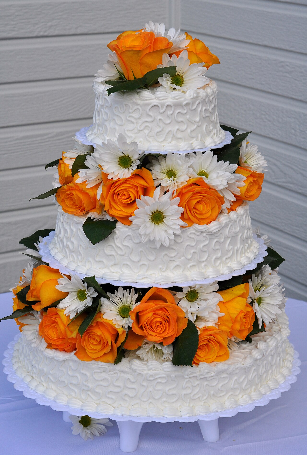
A bouquet has a visual structure
A floral display can be understood through more than its flower names or color palette. The American Institute of Floral Designers identifies elements of design that include line, form, space and texture. Those terms offer a language for describing how a composition is organized. At a wedding expo, begin with the overall shape, then notice the paths, surfaces and intervals within it. A display with several unfamiliar flowers can still be described clearly through those relationships. This kind of reading explains why two arrangements with similar colors may look different without guessing at seasonal availability, pricing or the practical requirements of a future order.
Form is the overall configuration
Form concerns the composition's visible configuration. A rounded mass and an extended arrangement can share a color palette while producing different outlines. Describe the outline from the viewpoint actually shown, because a front view may conceal depth. In a display, “a broad central mass with one extended side” communicates more than “large bouquet.” The description names the relationship between parts. A label may supply a recognized design term, but the visible observation remains useful beside it. This keeps terminology attached to the actual arrangement instead of treating a style name as a complete explanation of everything the display contains.
Line guides the eye
Line can be created by a visible stem, a repeated direction or the relationship among several elements. It need not be a literal drawn line. An arrangement might carry attention upward, across or outward from a center. Observe where that movement begins and whether it continues through the composition. A cluster with three repeated upward directions produces a different effect from one with scattered directions. This is a visual comparison, not a construction instruction. Naming the dominant direction helps explain the display's character and gives a reader something more specific than a general reaction such as “dramatic” or “relaxed.”
Texture changes the surface reading
Texture describes qualities that can be perceived in the surface and relationships of elements. A smooth-looking area and a finely divided area can create contrast even when their colors are close. At an expo, distinguish what you can see from any tactile quality described by the label. A photograph records appearance, not the sensation of touching the material. A useful note might say “fine visual texture beside a broad smooth-looking surface.” That phrasing is concrete and appropriately tied to the image. Texture can explain why an arrangement feels visually varied without relying on a long list of flower names.
Space belongs to the design
The visible intervals between elements are part of the composition. A densely filled outline and an open outline distribute attention differently. Notice whether the space allows an individual line or shape to remain distinct. In a display, a single extended element might be emphasized by the open area around it. Filling that area in a photograph would change the visual relationship even if the palette remained identical. Reading space therefore helps explain composition rather than merely counting stems. It also shows why two arrangements cannot be compared solely by the amount of visible material when their designs use space differently.
Compare two invented arrangements
Imagine Arrangement A as a compact rounded form with repeated broad surfaces. Arrangement B uses the same hypothetical palette but has an extended outline, narrow directional elements and open intervals. A color-only note would make them seem almost identical. A design note separates them through form, line, texture and space. The exercise can be repeated with an expo photograph: identify one relationship for each element instead of assigning a vague mood to the whole image. This method produces a description that another person can understand, even if they have not seen the display and do not recognize the flowers.
Keep the sample's scale visible
A centerpiece, bouquet and large installation can share design elements while performing different roles. Read the sample's stated purpose and dimensions when provided. A tight close-up may hide the arrangement's scale or its relationship to a table. A photograph that includes the surrounding setting can supply context, while a detail image clarifies texture. Use both for their respective purposes. A bouquet image should not become the assumed model for a large installation simply because its palette is appealing. The visual idea can be described separately from the object's role and the event-specific design that a provider actually proposes.
Write a design description with evidence
A concise description can combine the main form, dominant direction and one contrasting texture: “An open, extended outline carries the eye upward, with fine texture against broader surfaces.” Add the display's own stated role if it is provided. This is a more exact account than a mood word alone, and it does not require a claim about flower availability or cost. At a wedding expo, the vocabulary helps turn a fleeting visual response into an understandable design observation. It makes the display's structure visible while leaving practical specifications with the actual proposal and the provider's documented explanation.
Continue exploring
Explore related events
Current facts come from the directory. Follow the exact listing for admission, venue information and the official source.
Worcester Wedding & Bridal Expo 2027 · Mar 7, 2027 · scheduled · Public admission announced — check current organizer information
Sources and further reading
Source review: 2026-10-12. Examples identified as hypothetical are original illustrations.
An independently researched feature. Worked examples are illustrative; photographs identify their archive or collection context.
Find your next event →