
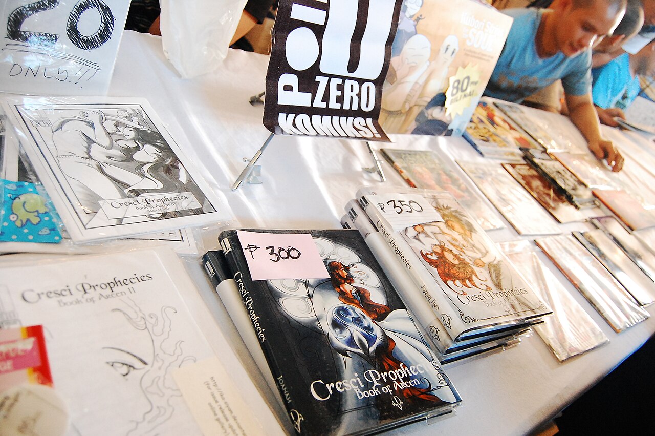
Lettering is part of the drawing
At a comic exhibit, it is easy to notice a dramatic illustration and treat its words as information added afterward. Lettering also controls the route through a page, the emphasis of a line and the apparent relationship between speakers. A panel can contain excellent artwork yet become difficult to follow when the words compete with its composition. Looking closely at balloons, captions and sound effects reveals decisions that are often invisible precisely because they work well. An original four-panel exercise makes those choices visible and gives a convention conversation a concrete point of reference.
Identify what kind of text you are reading
Dialogue balloons generally associate words with a speaker, while captions can provide location, narration or another kind of voice. The boundary is not absolute: a creator may deliberately use unusual forms. Letterer Nate Piekos’s Blambot guide documents conventions and also acknowledges that editors and space constraints can change them. Treat such references as explanations of a visual language, rather than requirements every comic must obey. Before judging an unfamiliar page, distinguish what you can actually see from what you infer. A rectangular box may identify a place, but its shape alone does not prove who is narrating the scene.
Follow the sequence before studying individual sentences
An English-language page commonly invites left-to-right reading, but composition, overlapping forms and the work’s own reading direction can complicate that expectation. First trace the panels, then trace the text within each panel. If your eye jumps ahead to a reply before finding its question, look for the reason: placement, text size, an image pulling attention or an unusual page arrangement. This is not necessarily a mistake. A surprise may depend on an interruption. The productive question is how the page organizes attention, and whether the order you experienced seems to support the sequence presented in the images.
Try an imaginary four-panel page
Picture a two-by-two page. In the first panel, Mina asks whether a door is locked. In the second, Jo answers that the key is missing. The third shows a key under a chair, and the fourth shows both characters walking away. Now imagine Jo’s reply placed high near the left edge of the second panel, while Mina’s question sits very low in the first. A quick glance could find the answer before the question. Move only the words in your imagination, keeping the artwork fixed. Which arrangement preserves the intended exchange? The exercise shows why lettering and drawing cannot be evaluated independently.
Connect a balloon to its speaker
A tail is a visual connection, not decoration. Its direction can help identify who is speaking, especially in a crowded panel. In the scene, a tail pointing between Mina and Jo might leave the exchange ambiguous unless another cue resolves it. Off-panel dialogue adds a further question: is the voice entering from outside the frame, or is a narrator describing the moment? Rather than inventing a rigid answer for every page, examine the surrounding panels. Consistency can teach the reader a work’s own conventions. Once those conventions are established, a deliberate departure may become a meaningful narrative signal.
Consider emphasis without reading everything louder
A large word attracts attention, but emphasis can also come from spacing, isolation, contrast or where a line falls relative to an image. Suppose Mina says she found the key. Emphasizing found changes the contrast with an earlier failure; emphasizing she changes the relationship between the characters. Neither interpretation requires changing the literal sentence. In an exhibited original, compare the line’s visual weight with the size of the action around it. A quiet response given a whole panel can feel consequential. Conversely, dense text can make a visually small incident take longer to read than a large silent image.
Sound effects occupy the scene
Sound-effect lettering represents an imagined sound while also functioning as a graphic shape. Blambot describes the relationship between letterform and perceived intensity; the original example here goes further as a looking exercise. Imagine a door closing with a tiny click near its latch, then with a huge word spread across the panel. The drawn door is identical, but the perceived event changes. Also notice what the letters conceal or reveal. A sound effect that covers a character’s face can delay your access to their reaction. One that sits beside the action leaves the expression available immediately. These are compositional choices as well as auditory suggestions.
Describe the effect, then name the technique
A useful exhibit note begins with an observation: I read the reply first because its balloon sits higher. It can then identify placement as the technique involved. That is more informative than saying the lettering looks professional or crowded without explaining the result. Publisher process material, including VIZ’s manga-creation overview, places lettering within a broader sequence of page development. Use that context to appreciate collaboration without assuming who made an undocumented change. At a lettering display, select one place where the words redirect your attention and explain the visible reason. That small observation can open a substantive conversation about a page’s construction without pretending to know every decision made during its production.
Continue exploring
Explore related events
Current facts come from the directory. Follow the exact listing for admission, venue information and the official source.
FAN EXPO New Orleans 2027 · Jan 8 – Jan 10, 2027 · scheduled · Tickets on sale — check current availability
Sources and further reading
Source review: 2026-10-12. Examples identified as hypothetical are original illustrations.
An independently researched feature. Worked examples are illustrative; photographs identify their archive or collection context.
Find your next event →